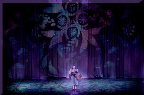
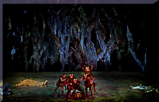
| Description of the 1992 Settings:
Texture and light interactivity were central
elements in this production. I approached the piece more in the dance
idiom than in a traditional Broadway mode. Although I love to design
such shows, this was the first time I was allowed to demonstrate this
style fully on a NYSTI show.
Since I was out to surprise audiences with a
fresh approach, I elected to design Kansas in a more traditional style,
reminiscent of the Oliver Smith musicals of the 1950s. This choice also
allowed me to maximize the contrast between the world of Kansas and the
worlds "over the rainbow".
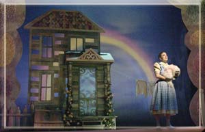
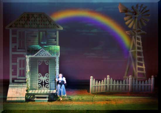
Kansas consisted of a stylized farmhouse
building. It was designed in three pieces so that when the tornado hit
it could fly up and off to two sides simultaneously while splitting up.
The cyclorama was a major element in this world to accentuate the
flatness of the Kansas topology. There was an indication of a split rail
fence as well as a farm windmill.
In the film, the house is very weathered and
gray almost like a piece from Tobacco Road. I opted for a more quaint
farmhouse. I felt that Auntie Em had too much pride to let her house get
too run down. I also wondered why Dorothy would find that there is
"no place like home" if it was so devoid of life. So in this
case I made the house itself somewhat of a refuge in a sea of dry
dust-bowl land.
At the point of "Over the Rainbow"
and then the tornado, I wanted the element of magic to take form. To
achieve the feeling of the dry land I took a gamble on an interesting
idea. If it worked, it would be great. The gamble was to cover the floor
entirely with erosion cloth, but to not attach it. When the tornado
struck, scenery flew and twisted and skidded every which way within our
pyrotechnics, but most impressive, the earth itself was pulled into the
vortex. Actually the entire floor was pulled into the pit. The effect
worked beautifully. The real risk in the technique was that the cloth
was over a highly glossed floor to represent the lands over the rainbow.
It was hard at times to maneuver on the erosion cloth, especially with
Mrs. Gulch�s bicycle. The effect was so very striking though that the
performers opted to keep the design element.
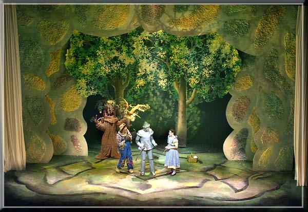
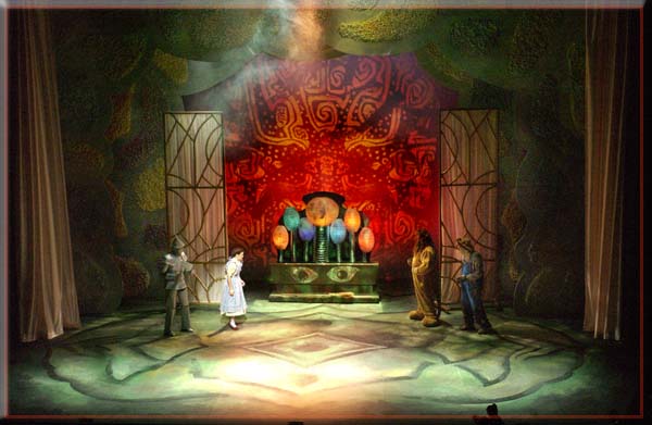
Under the erosion cloth, the floor was rendered
in jewel-like organic, metallic forms. The floor resembled a forest
floor glowing with the light reflecting from the dew. It was a marked
contrast to the brown of the erosion cloth.
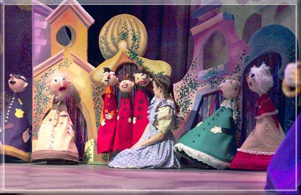
Munchkinland was rendered entirely through the
use of magical sculptural elements somewhat resembling enamel abstract
floral jewelry floating in space.
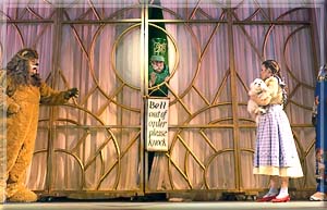
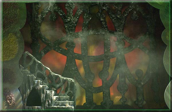
Then for different parts of the forest or the
witches castle we used a series of different 3-dimensional cut drops
which could be lit dimensionally from the side, or lit through to the
cyc, or serve as a canvas for our Pani projector images.
Conceptual Foundations:
As part of my research, I was able to locate a
copy of the 1917 silent film of Oz which included Oliver Hardy in the
cast. I was struck by an honesty in the telling of the story that was
lacking in the MGM version. The plot too was rendered in a much more
realistic manner. This is not what I had expected of a silent film of
the era.
In designing the piece on stage I too then
wanted to explore what might be considered a more honest approach.
Visual realism though would have stifled the true expression of artistry
in the piece which followed, I felt, the path of truth in the expression
of feeling and emotion.
In making my choices I applied some of the
ideals of the impressionists. Their work was not in opposition to
reality, but rather it was dedicated to exploration of the levels of
reality that lie beyond the material world. The world of the
impressionists was one of light as it interacts with atmosphere,
revealing the nature of emotional sensitivities and realities of spirit.
Use of abstract forms allowing for the
interplay of light on them allowed for this aspect of the play to unfold
in a way that traditional scenic styles had not. Indeed the result was
refreshing.
|
