|
Context/Pretext:
This production was most recently produced in the
end-room configured black box theatre at The University of Colorado,
Denver based largely on a design produced 10 years earlier at State
University of New York at Stony Brook. The design for the Long Island
edition won two awards, the Long Island Drama Critics� Herald Award for
best scene design; and a Kennedy Center/ACTF Award as well. Although the
floorplan was similar between the two versions, changes from working with
a new director, as well as a very different treatment of the floor and the
hanging pieces resulted in a very different feel. Personally I like the
second edition better, but the similarities and contrasts between the two
editions makes for an interesting study.
Description of the Settings:
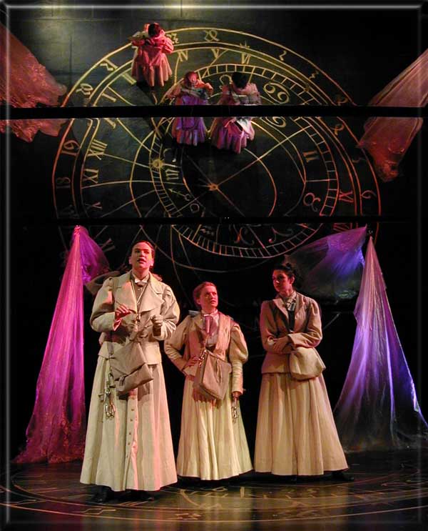
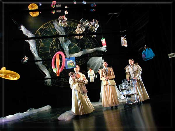
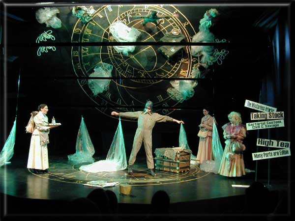
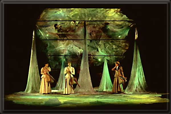
The set was simple in it�s image, more complex
in its optics. It was presented within the proscenium frame of this
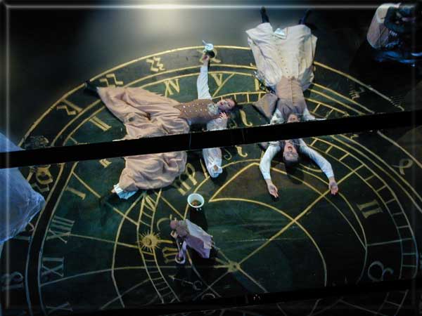
end-room space. The stage in the most recent edition was rendered glossy
black, on which was painted in reverse, a copy of the grand Prague
Astrolabe which was reflected, along with the performers and kinetic
elements, in a full-stage-sized 45 degree angle mirror. The earlier
edition of the production featured layers of dyed cheesecloth on the
floor, which was immediately reflected as a backdrop by a full-stage 45
degree mirror. The use of the mirror meant that performers were always
seen in two views, elevation and plan, by the audience.
The mirror panels were made of separate
strips, 4 foot in width, and running the width of the stage. A gap was
created between these panels, compositionally creating a series of black
visual lines running horizontally through the stage picture.
The gaps also allowed for lines to pass through
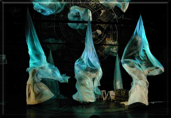
to a control assembly off-stage. On to the onstage end of the lines, was
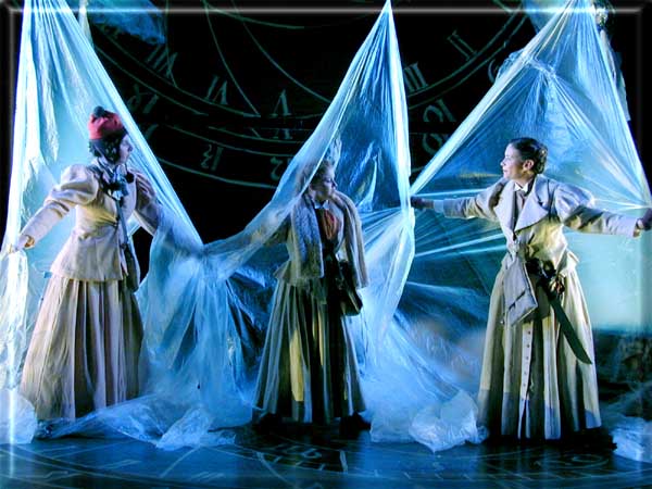
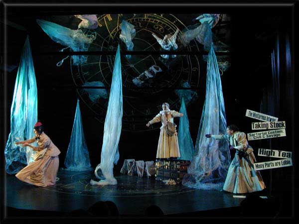
attached panels of thin polypropylene in the most recent edition and
tobacco cloth in the first edition. These were each about 30 foot square.
These panels could move up and down independently or in various
choreographed unison movement patterns.
The effect of all of this was very much that of
"being within a kaleidoscope" .
Conceptual Foundations:
Certain unique and wonderful ingredients in the
structure and content of On the Verge immediately confront the
reader or audience member. To begin with, the characters seem to be both
rooted in, while being simultaneously lost in, the fabric of time. One
minute we are in the world of Victoria, the next, at a 1950*s
gas station � and all without the slightest bit of explanation. It*s
as though we, the audience members, are an Alice in yet another
Wonderland.
Another striking ingredient is the use of
language. Structurally the play reads somewhat like a Gilbert and Sullivan
patter song. Clearly Overmeyer revels in the music of language. The
language also has an element of "linguistic challenge" as if
each phrase is a puzzle to be solved (by the characters as well as the
audience members)
This use of language and complex riddle is
reminiscent of the works of Lewis Carroll � especially Alice in
Wonderland. A more recent literary parallel might be drawn with
Douglas Adams* series The
Hitchhikers* Guide to the
Galaxy.
Works in this genre present a paradox for the
stage designer. All of these works are absolutely dependant on the imagery
of wordplay. Any visual element can easily detract from the carefully
crafted structure of the spoken word. Productions on stage or in film, of Alice
in Wonderland rarely succeed. The words of the text conjure in our
brains, far better images, and far quicker transitions than any stage play
or film could ever hope to achieve.
So... at the start, On the Verge was
perched an the same tightrope as both Alice in Wonderland and The
Hitchhikers* Guide to the
Galaxy. To maintain the feeling of fun and wonder that I had when I
first read the work, I determined that the following would be required of
a potential scenic environment:
A. The audience had to understand that the locale
was in "the fabric of time itself" and not merely in specific
locations.
B. The set had to incorporate elements of fun and
naive discovery to parallel the texture of the dialogue.
C. The set had to be presentational � entirely
non-realistic.
D. The set had to allow us to explore "the
whole universe" in our smallest stage space.
E. The set had to allow for continual changes in
the basic interpretations of the work as they evolved. The set had to be
able to support improvisation.
F. The set had to allow us to
"instantly" move in time and space.
G. The set had to provide opportunity for
scenic�actor interaction.
H. The set had to be easy to build, with the
important elements available early for incorporation with the blocking.
I. The set had to enable us to communicate
essential information re. time and place to the audience members in a
quick & efficient manner.
J. The set had to create an otherworldly
experience for the audience enabling them to empathize with the strange
situations that the characters were finding themselves in.
K. The play is structured much like music with a
clear rhythmic structure that develops to its conclusion. Ideally the set
should also be able to "develop" � allowing the audience to be
taken on their unique journey.
Since all of the strange encounters, p1aces, and
objects in the play seem to materialize out of the "fabric" of
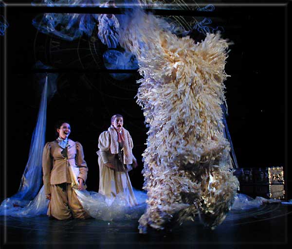
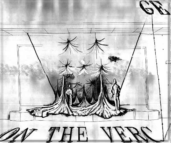
space and time, I made fabric my central visual metaphor. With the use of
seven pulleys we were able to quickly and creatively form the abstract
landscapes called for in the script. The fabric could easily be made to take
on the characteristics of mountains, forests, or ice fields. The fabric also
encompassed a feeling of motion; of constant flux, parallel to the element
of time in the script. The use of fabric allowed for fun interaction between
scenic elements and the actors.
The combination of the fabric and the pulleys also
satisfied the requirement of scenic "development". The play was
able to start with the fabric swirled out on the floor in an image of the
firmament, or a galaxy being formed. When the trees finally "grow"
out of this fabric field, the experience is designed to pull the audience
into the spirit of the work. By the end of the play, the fabric has settled
� we are back in the firmament waiting to begin our next adventure.
Besides the fabric, the other major scenic element
was the large full stage mirror placed at a 45 degree angle to the floor.
All of the imagery on the floor was repeated as a cyclorama image with the
help of the mirror.
The immediate effect of the mirror was to greatly
expand the space.. It now became possible to portray the universe in Theatre
II ! Since the actors were reflected in the mirror we were always left with
the feeling of them "floating" through time and space � another
helpful image. The mirror also helped to make the patterns on the floor
become visible to the audience. At times, in fact, the reflection of the
floor resembled a giant relief map. It was an effect reminiscent of the maps
charting explorer journeys in the old 1930s movies.
|

