|
Context/Pretext:
This production was presented at The
Perry-Mansfield Academy and Camp, in the Julie Harris Theatre. A full
explanation of the circumstances of the Perry-Mansfield productions is
offered earlier in this portfolio in the section on Into the Woods.
As in the case of Woods, resources
available were extremely limited. The budget was around $1,000 and the
set had to be built by about 3 of us in less than a week.
There was no shop space available so set
construction had to share the space with rehearsal functions. The
critical shortage of space had a special impact on the painting of the
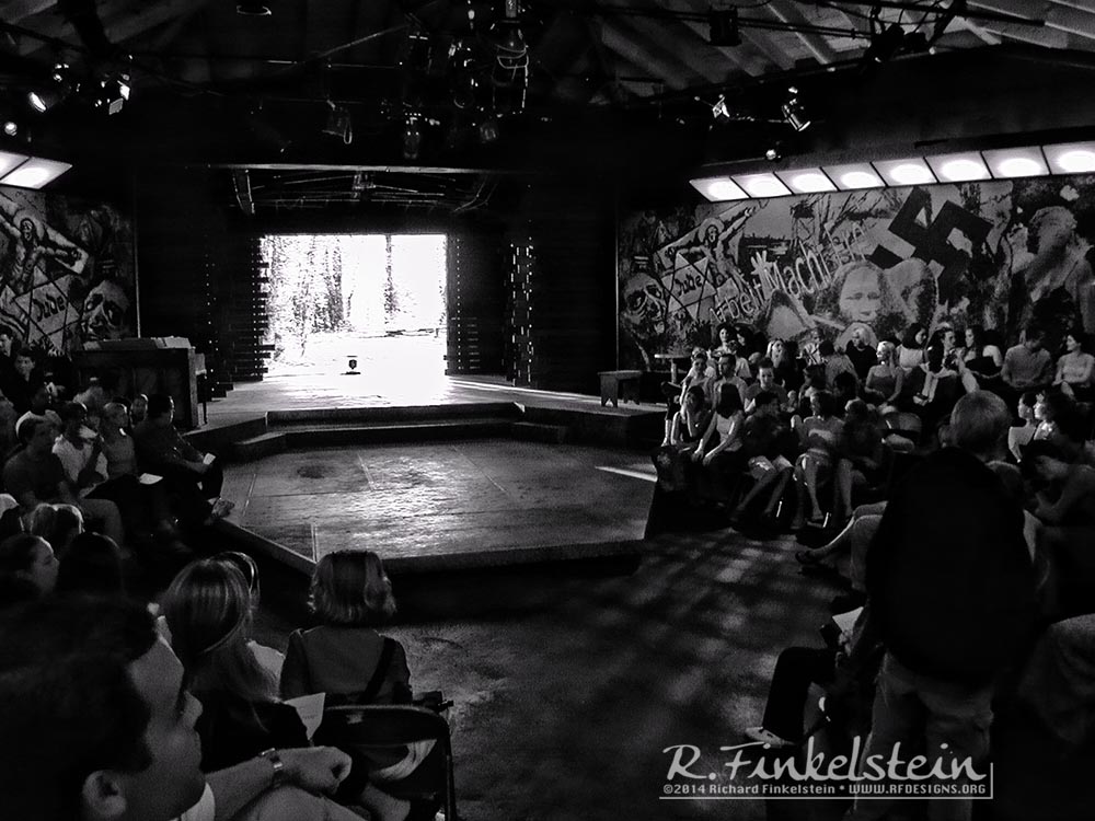
two 8 foot by 24 foot murals decorating the walls of the theatre. I
had to paint these in another rehearsal room. Since the room was in
constant use for rehearsals, I had to paint each of the murals during
a short 8-hour window starting at 10pm on two subsequent nights.
Into the Woods
explored the use of organic forms in the space. It explored the use of
earth tones. In contrast, this production was presented in a thrust
configuration, using only neutral tones, except for the red of the
swastikas adorning the murals.
In actuality this production was presented
immediately before Woods, and the time available for the basic
turnover was only a day. With this in mind I played origami with the
central acting platform. For Woods, this thrust came out into
the room, was re-legged, and clad in floorboards to become the new
main acting area. Designing for Perry Mansfield is all about being
clever and spare in the use of resources.
Description of the Settings:
The setting used much of the warn with time
environment of the raw Julie Harris theatre. In a sense, for this show
I used the same division of space on stage that I had earlier used in Clytemnestra,
but to vastly different effect.
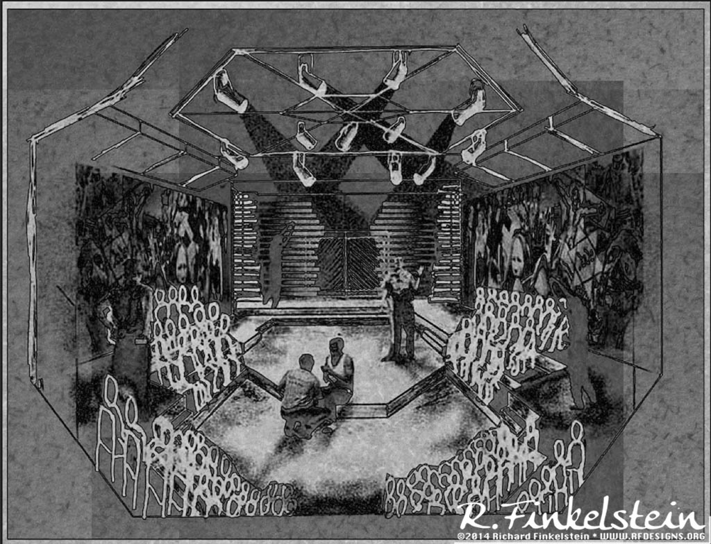
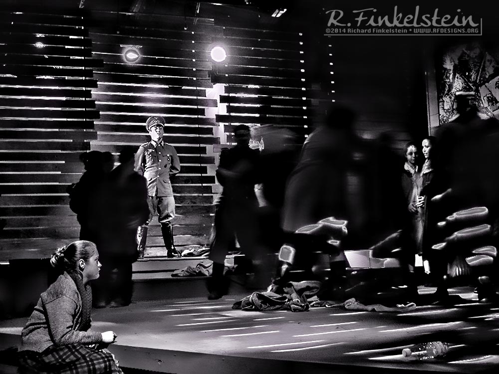
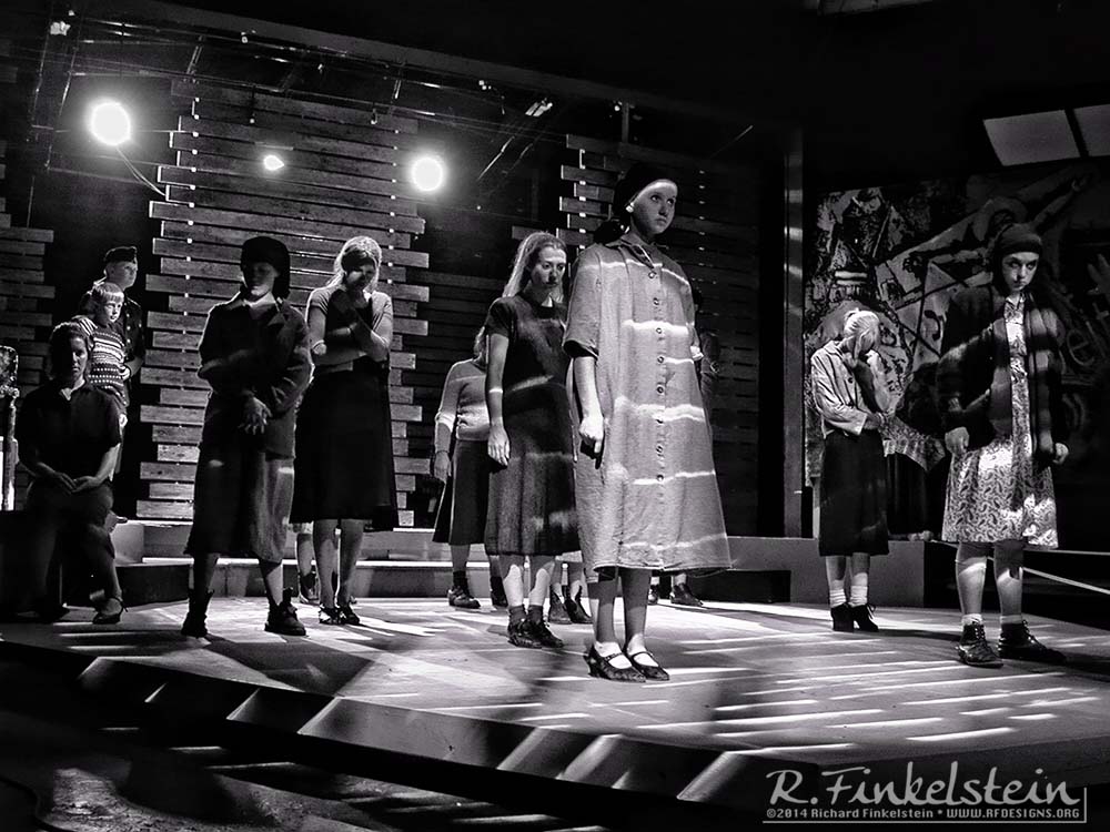
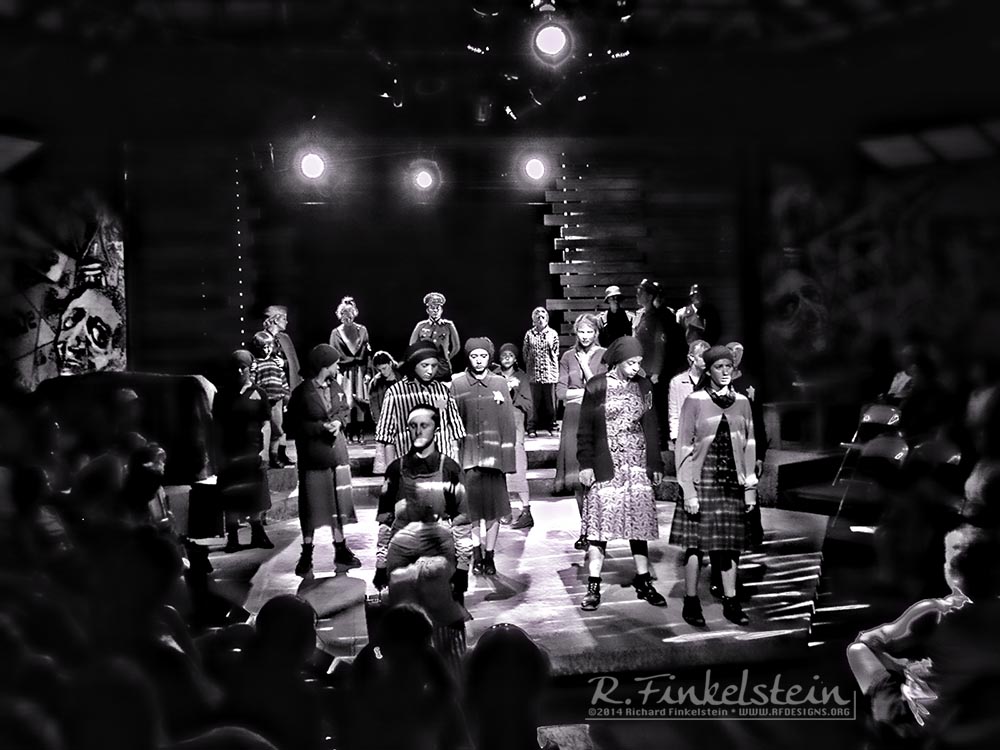
The stage proper had placed on it, three sets
of screens made from horizontal weathered boards. Two of these sets of
screens could move horizontally so as to form walls, entries, etc.
On the back wall, we made use of the large
barn-like loading door. At the start of the show, the performers were
outside of the theatre. They entered through this rear door which was
then slammed, giving sound and voice to the image presented by Arthur
Miller of the prisoners entering the cattle car for the journey to the
extermination camps.
At the front of the stage, was a thrust that
extended significantly into the audience space. There were some
changes of level, but the image was largely one of blank space.
Conceptual Foundations:
The image of the characters being herded into
the cattle car at the start of the script is a striking one. This
image gave genesis to the structure of the design. The use of the
moving slatted screens never let the image of this animalistic
imprisonment leave the minds of the audience.
The lighting designer mimicked this motif
through the use of a Film Noire style of colorless, contrasty, slashes
and slits of light.
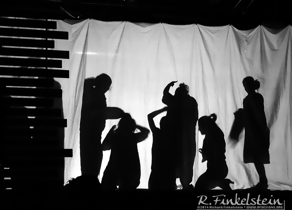
In homage to the work of Brecht, I made use
of a half-stage curtain onto which could be projected silhouettes of
actors at various key dramatic points in the script.
What I set out to do was to create a
striking, spare, dramatic, space to be dominated by the actors in the
piece.
|

