|
Peter Pan - Scenic Design by R. Finkelstein -
The presented this
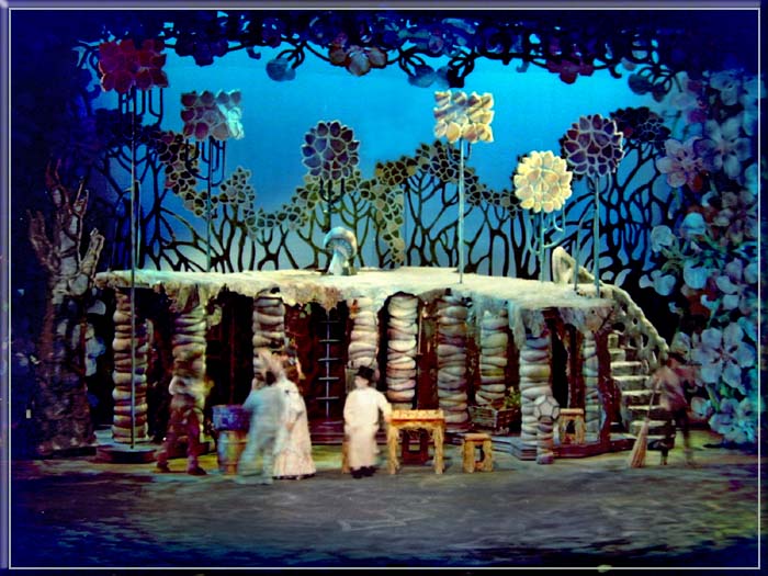
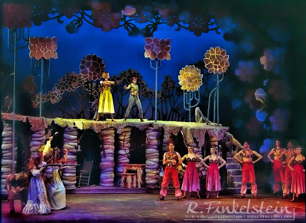
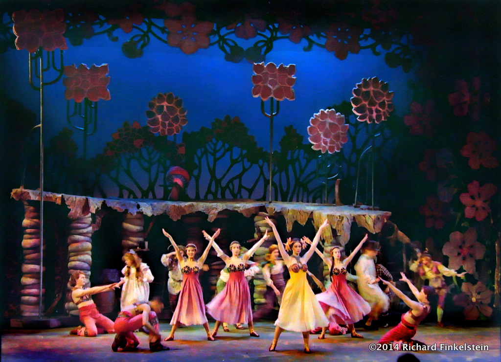
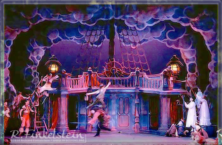
production in Albany NY for two seasons followed by a tour to Moscow Russia. Depicted
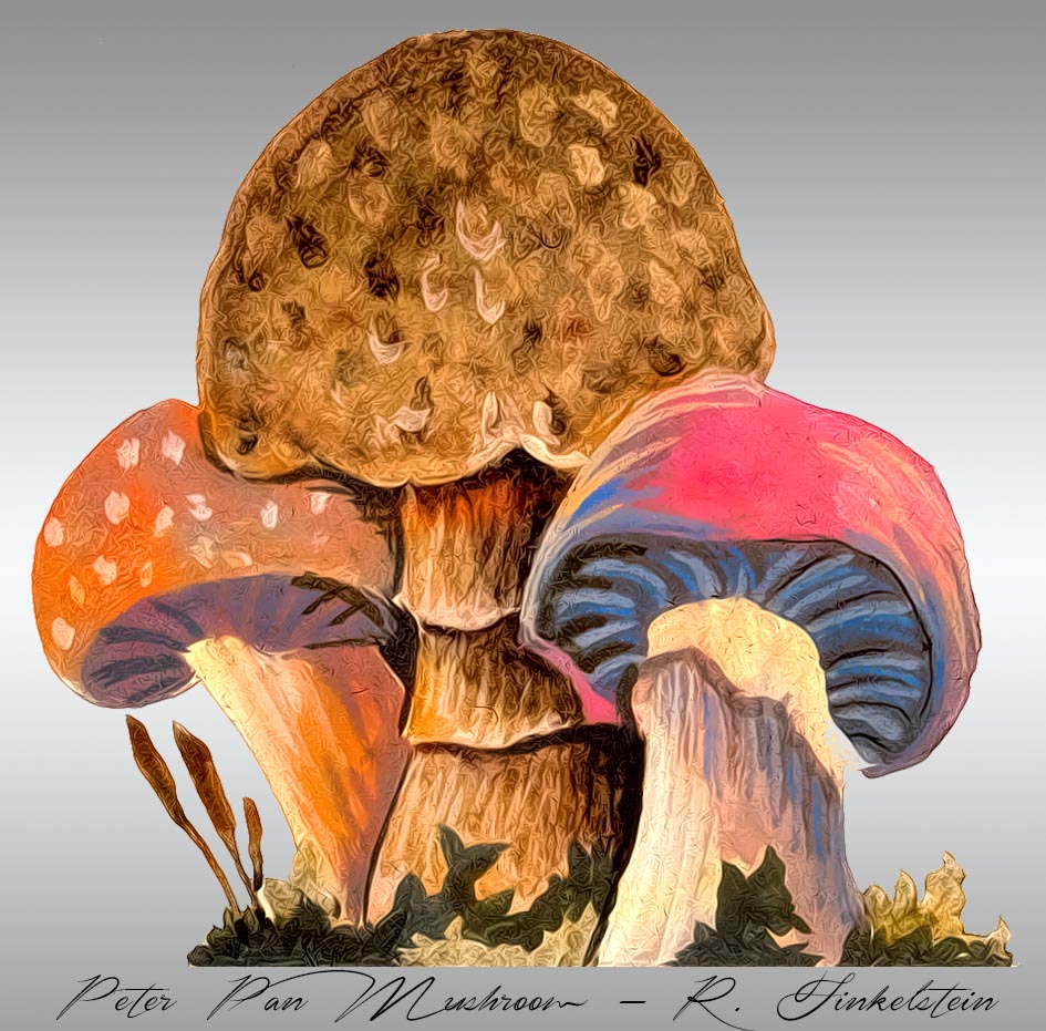
below are views of the Home Underground. Pirate Ship and a painters elevation of one of
the mushroom groundrows.
[]


Depicted below is the painters' elevation of the home underground mushroom.

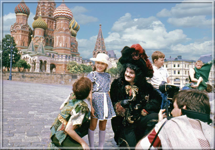
Depicted Below: Performers in Red Square
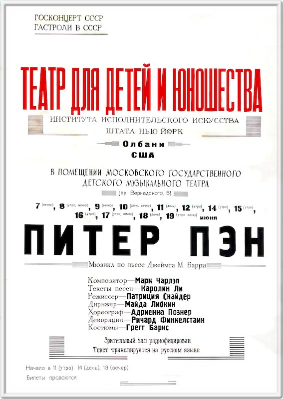
and the poster advertising our show.
Even if you can't read Russian you can
recognize my name. It is the long one.


Context/Pretext:
This production was mounted as part of a tenth anniversary
celebration of the birth of The New York State Theatre Institute. It
was also a property with a lot riding on it, and a lot of history as
well. It represented a third-generation passing of the torch, as it
were.
Ten years earlier, for the inauguration of the $100,000,000
"Egg" at The Nelson A Rockefeller Empire State Plaza, Donald
Oenslager had been hired to design the gala production of Peter Pan.
This was a very big deal. The facility, one of the most unusual
buildings ever built in the world had taken 13 years to build, and it
itself was part of a complex so large and unusual that it was the
largest building complex in America�s history. The theatre itself,
seating 1,000 was largely hanging off into space, supported at only
three points, seven stories above "ground" that in itself
was atop another 5-story structure. The complex was designed by
Harrison & Abromowitz, known for such landmarks as The UN building
and the New York State Theatre at Lincoln Center.
I was brought in by Mr Oenslager�s associate, Klaus Holm, who I
had studied with at Wilkes College. I was to supervise the mounting of
the production as well as the opening of the theatre.
Tragedy struck though. Donald Oenslager died early in the process.
This was the last project he had worked on. The design reins were
taken up then by my teacher, Klaus Holm, who completed the design
based on the research that Donald Oenslager had assembled for the
project. The show was a very great success.
However, the scenery did not survive the next ten years in storage.
It also had a dated feel. Times had changed.
While working on Amadeus at NYSTI, I made the proposition to the
producer that if they were ever to mount the production again, I was
interested in producing it within the idiom of The Art Nouveau. Years
earlier they had rejected a similar proposal, but this time they took
me up on my offer. I had been somewhat of a scholar on James Barrie. I
had read all of his plays and had spent years researching in
particular the intricacies of the genesis of Peter Pan. I had always
felt strongly that Art Nouveau sensibilities were central to the
interpretation of the work. It was quite exciting for this designer to
be allowed to lead in the interpretation of the production.
I also used the opportunity to pay homage to the two generations
before me that had pioneered design work at The Institute, Oenslager
and Holm. In this sense the basic mode of production was traditional.
The innovation came in the Art Nouveau style used.
The show was very successful, and it later became the second
theatre production to be invited from America to be presented in
Russia since the start of the cold war. (The first production too had
been produced by The New York State Theatre Institute, The musical Ragedy
Ann, presented two years earlier in Albany, Moscow, & on
Broadway)
With the international scope of this project, the idea was to
present a production also of grand scope. This was also necessitated
by the sheer size of the facility that was hosting our work in Moscow.
Natalia Sats� theatre had a stage exactly the size of The
Metropolitan Opera House in New York, and had much of the same
technical facility. I did not want our set to be lost in such a space,
so I designed to every inch of the much smaller theatre house in The
Egg.
Description of the Settings:
There were about seven different sets presented in this production.
In the portfolio, I show two of the most striking as examples. It was
presented in a traditional wing and drop style but made extensive use
of cut drops and interesting three dimensional forms.
The stage itself was framed in an elaborate cut portal design
depicting the gate to Kensington Gardens in homage to the genesis of
Peter Pan. Within this frame, there were portals for each of the major
sets.
The nursery set was kept very simple in form. It was made to look
almost like a children�s doll house. It was designed in perspective
so as to maximize the much smaller real space available. The idea was
to present a handsome environment that would not call much attention
to itself. Almost like the situation in The Wizard of Oz, the
idea was to present a rather mundane environment allowing for a burst
of magic as the action moves to other dimensions.
Except for the main structure of the pirate ship, the rest of the
scenes were designed to be of maximum contrast to the nursery. The
home underground was based on a very complex multi-raked structure.
The model for this architecture was the work of Spanish architect,
Gaudi.
Of interest in this scene is the home of
Tinkerbell. In traditional
productions, she lives in a stump. I never bought this. Tink is a
prima dona. She NEVER would live in a stump! In our edition she lived
in a glowing dodecahedral crystal.
The forests of Neverland were presented using a series of
whiplash-lined Nouveau cut drops and a very organic ramp of moss.
The ship was actually based on a re-orientation and re-clad facade
of the home underground. The challenge was to render the organic
forms, rectilinear. The portals in this scene are inspired by a motif
pioneered by Ert�.
[]
|
