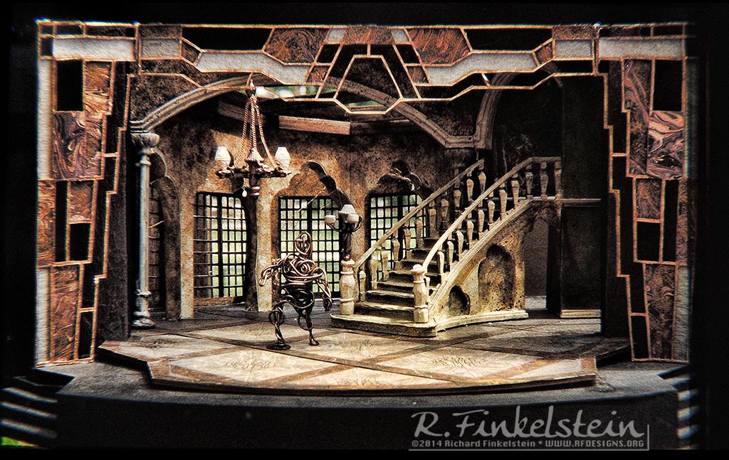
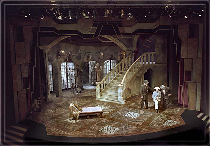
Depicted on the stage was a mansion like those
to be found in Palm Beach. In this case, though, the mansion was under
great disrepair and even corruption. Vines had long ago penetrated from
the garden, grown into the space, and then died. There was a grand
curved staircase and a marble floor, cracked and warn.
There was also a chandelier as well as a newel
post light at the foot of the stairs. These too were in disrepair.
Closer inspection revealed wires strung to these fixtures from a
bicycle-like contraption up-stage. Could this be a Gilligan�s
Island style pedal generator?
The only furniture in view was a single chair
and a chaise (see the production photos). Also in the stage picture was
a suit of armor, standing by the archway under the steps.
The house curtain was used in this production,
as it was very important for some stylistic choices we made in
production (see below). The entire picture was further framed in by a
bronze-like Art Deco portal.
The set proper consisted of a series of walls,
french windows, archways, a colonnade, beams overhead, and cobwebs.
Decorating the walls were a series of animal heads, decayed by years of
neglect.
Discussion of concept began with a brash quip
from the director, John Dennis:
"In this production we show
that....Norma Desmond has a neighbor..."
His tone of voice was quite sarcastic and we
all understood immediately his point. There are those who are born of
society, and those who aspire to it without a clue as to what life at
any level is about. In Moliere�s text, social conventions are turned
on their head. In this edition this is quite magnified.
John Dennis had suggested the Hollywood of
Sunset Boulevard as our backdrop. He wanted to find a parallel in a
society where pretense became everything, where even homes themselves
were some sort of theatre set, a facade of life rather than anything
real or anything to be taken seriously. The Director also came to the
discussions with a
plan to make liberal reference in the
characterizations to various comedia Hollywood actor types. We had a
Tarzan entrance, swinging across the stage from the top of the stairs on
a vine. One of the characters too was patterned after Chico Marx.
The spirit of Jack Benny was also important for
the director. Mr. Dennis particularly noted his lovability intertwined
with his absolute miserly qualities (in character at least). Benny�s
character would go to infinite, almost improbable lengths to save even a
penny. Dennis proposed that we even duplicate Benny�s basement vault
guarded by alligators (we did).
One thing I greatly admired about working with
John Dennis was the way, as a director, he would set a course, but then
allow his collaborators to run with it. For instance, the director
thought it would be a nice idea for things to be in such decay that when
a piece of the set would break off, Harpagon would simply affix a price
tag to it for some future sale.
Often my role in the directorial proposals was
to take the basic ideas and then to test the limits of how far we could
go. The director�s idea of affixing price tags made me think of the
scenic circumstances set out in Moliere�s text. Moliere calls for
furniture and boxes to be assembled in the grand hall for some sale. Our
Harpagon though, with a character taken to extreme, would have sold all
his furniture long ago. This is what reduces him to selling pieces of
the set, broken chair legs, etc. What is especially fun is that Harpagon
is so driven by his miserliness that he doesn�t even act as though his
decor is unusual.
I proposed going even farther yet, and this
allowed for a nice fusion between all of the design elements. The idea
for the generator, for instance, I believe was mine. If he is so int
saving every penny, our Harpagon would certainly not be above
"theft of services". The device of a pedaled generator made
for some very funny blocking, pacing, and lighting opportunities. The
director chose certain key moments in the show. At these points, the
lights would suffer a "brown out" until the servant, or in a
pinch Harpagon himself would pedal his way into the light.
The first time this device was used was
especially interesting. At first the audience thought it was a lighting
mistake. Revelation that the strange contraption upstage was a
generator, thus became that much more fun.
If Harpagon was such a complete miser in our
version, why then would he have multiple servants as Moliere had
written. In a stroke of collaborative inspiration we all agreed to a
scheme whereby one actor would play all of the servant roles, especially
that of the chauffeur and the cook. The director and costume designer
then set out to find the perfect Hollywood archetype for these two
characters. They chose to portray a German chauffeur (with a Duesenberg
of course) and a French Chief. The actor playing the dual roles was then
required to shave his head. This allowed for a most remarkable lazy-susan
type hat device. Half the hat was that of a chauffer, the other being
that of a chef. This mode of presentation became very funny and was
especially entertaining during scenes requiring arguments between the
chef and the chauffeur!
More evidence of the collaborative process
allowing us to test the extremes came with the director asking if the
chair could have a leg break off (Harpagon would put a sales sticker on
this too). The director thought it would be both fun and revealing when
Harpagon would then sit on the three legged chair.
Here too, I used the director�s idea to
postulate the end projection of the theory: What if more than one leg
could break off? What if three legs broke off, and what if Harpagon
could sit just as soundly on a one legged chair as an ordinary mortal
could on a 4-legged chair? Our Harpagon weiged over 200 pounds so it
took some special steel alloy and welding to realize the trick but the
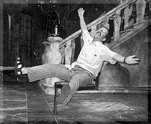
effect was quite rewarding. In the last production photo presented here,
you can faintly see the chair in its one legged configuration, down
stage left.
While we pushed the limits through our visual
commentary, the director was careful to pace the gimmics and to ration
them well. In this way, each time, these came as an absolute surprise to
the audience, thinking they had already seen the limits of this
character�s potential for buffoonery.
After the director gave us our "Norma
Desmond" marching orders, I looked hard for visual research related
to Palm Springs. While I found some photos of the homes of stars, the
few I found were mostly bad modern restorations. I came across, though,
a vary high-end Abrams publisher book dealing with the architecture of
Palm Beach. I always confused these two "Palm" cities in my
mind and was further confused when I first looked at the book. The
architecture between the two cities looked similar to me. As it turns
out this was one of those very happy accidents in the work of a
designer.
Palm Beach in Florida, at least as we think of
it, was founded architecturally, by Hollywood�s mega-stars trying to
escape from the now crowded Palm Springs in California. More
interesting, especially to our production and to theatre in general, the
prime architect of the look of the homes in both locations was from
Joseph Urban. While I was very familiar with the pioneering stage design
work of Mr. Urban, I had been unaware that he was also an architect. The
stars would see his work on the stage and would then commission him to
design their homes. It is thus no accident that the homes read almost
more as sets in some fantasy life than as home as us non-stars would
know them. The whole concept of pretense in the way we live as well as
delusion and self-delusion was thus ensconced within this mode of
architecture itself.
I have of course seen thousands of shows in my
lifetime and have worked directly on hundreds. Yet I cannot think of any
that had a more fun or striking opening moment than that of this
production, as orchestrated by John Dennis, the director. Within the
first few moments he jerked the audience, almost physically from their
seats, as though they were in some Disney flight simulator ride - All
the more surprising in a staid classical comedy such as this one. Again,
this moment demonstrates a synergy between directorial vision, physical
action, and other design elements, particularly in the arena of scenery,
props, effects, and sound.
When the audience entered the theatre, they saw
a very traditional intimate proscenium theatre with warm tones. There
was a maroon velour curtain lit with traditional red curtain warmers.
The curtain was framed by the bronze portal. Preshow sound was
overly-traditional music one would expect of a generic Moliere show. I
could imagine that many audience members by this time would have been
thinking: "finally CSF is doing a classic TRADITIONALLY!"
As in such "traditional" fare the
house lights dim, the curtain goes dark, the sound fades, as the
audience hunkers down for yet another classical performance. Instantly
though, the audience, with the opening of the curtain, is jarred into an
environment totally at odds with expectation. Smoke billows from the
stage into the audience. The stage itself is bathed in eerie stormy
light. It�s as though we are in some sort of Gothic melodrama, in the
bogs around Scotland. The music in an instant transition with the
curtain is loud, brash, stormy, and indeed is interspersed with the
sounds of a storm. "Wait, are we in the right theatre? Is this
Moliere, or Dracula....and what would Dracula have to do with Moliere?"
the audience must at an instant wonder.
Then, from within the fog, at the top of the
steps, enters a shadowy character clutching a box as though his life
depended on it. He is clearly agitated, perhaps even paranoid as he
moves down the rocks - or are they stairs - hard to tell in the fog. He
makes his way down stage. From out of the fog he lifts a trap door and
the audience is treated to a snapping alligator right in their faces.
The figure descends from view, the trap door
slams loudly, and then....at an instant, a count of zero, the world
reverts back to the world of Moliere. The fog is gone, the lights are
bright, the music is a twinkling ditty, as the young lovers enter
wearing summer clothes of pastel colors, while they hold their tennis
rackets. Clearly, this is to be an evening FULL of surprises. It was,
and it was a joy to work on.


