|
Ibsen's Ghosts- Scenic & Lighting Design by R. Finkelstein - Produced at The University of Colorado at Denver, College of
Arts and Media at Denver's Acoma City Center Theatre. Production debut: October
6, 1999. The production is directed by Kathy Maes with costumes by Penny
Cole.

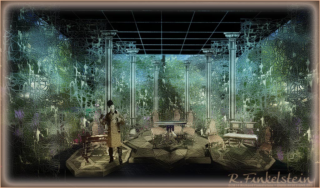
Above is a rendering of the production.
The unit set appears within a surround reflecting the connections within the
world of the Impressionist Arts movement. For most of the play, the painted
backgrounds are obscured by the panels of overgrown vine-like and color-less
panels acting like scrims.

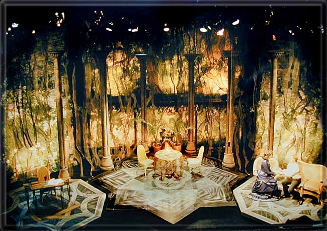
Above simulates the effect of the drops
bleeding thru the scrim streamer panels at the end of the play.
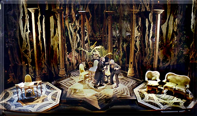
Production photo with drops
bleeding through . . . . . . . . . . . . . .Scenery as it plays through most of the
show
Description of the Settings:
The set for the show was transformational in nature. The image
presented to the audience when they entered would change by the end
into an entirely new image. I had done this earlier with As You Like
It which made the change through mechanical means (through the use of
cut-roll drops). This time I wanted to affect the change entirely
through the use of light reacting with the scenery elements.
The stage itself consisted of three platform plates: a center area
and two side areas. These were painted in a marble pattern.
Columns framed the areas helping to define the domestic space.
Outside the column areas were texture panels made from layered strips
of organically ripped cheesecloth dyed and attached to scenery net.
These gave a hint of dead overgrowth and served as scrim.
At the end, revealed through the scrim panels were three drops that
entirely filled the surround of the stage. These were painted like an
impressionistic painting of a lush, sun-drenched forest with a stream
running thru it.
Conceptual Foundations:
I feel that the designation of Ghosts as an impressionistic work
was quite apt and thought provoking. Indeed many parallels could be
drawn between the movement in painting and what Ibsen was doing
contemporaneously within this work.
As in the case of impressionistic painting, in Ibsen�s Ghosts,
the reality can be found more between the lines, in what is NOT said.
The text of the play as well is also imbued with images of light and
darkness.
We decided to approach the imagery of light and darkness in an
ironical manner through the scenery elements. We use the moment, at
the end of the play, when Oswald goes blind to reveal the full set
depicting a sunny world, full of life, color, trees and water. While
the character is newly blinded in his eyes, this also marks the moment
of clarity in all the character�s understanding of the nature of
their realities. At the moment of blindness, ironically a veil was
simultaneously lifted allowing the characters to fully understand the
true nature of their lives. After sitting in a world of decay and
greyness, moving to a world of blinding color and light was a very
powerful moment in the audience� experience, especially as it was in
counterpoint to the action of the moment on stage.
Before this moment of revelation on stage, the atmosphere of the
setting and lighting environment was one of greyness, and life�s
potential grown sour. The cheesecloth strip scrim panels gave the
impression of the growth of vines, overpowering the environment and
then freezing in death. The vines though also contain a hint of the
forms of dendrites and axions in the brain, in this case too, frozen
in an entangled embrace of death.
While the rendering appears to emphasize this element, the
production photos reveal that when minimally lit, these scrim elements
faded out of the stage picture. The feeling on stage was largely one
where each actor was isolated in this world of decay from simple
neglect and lack of nutrient.
Lighting Choices:
With the limited palette of available lighting tools I had to be
most economical in my choices. I wanted to be able to emphasize the
transition between the pallor of death surrounding the homestead into
the world of light reflecting the revelation of understanding that
came at the moment of death in the material world.
Since I knew that lighting levels would generally be low, I used
very light blue gel so that the red-shift at low level would be
counteracted. I worked towards a very gray light. I used as well a
directional wash of warm light so that the sun could be revealed as
the transformation happened. I worked hard with the limited lighting
too, to keep the feeling of isolation between the islands of actors
without looking affected.
Angles of light over the stage proper were kept steep, not only to
enhance the drama but to also keep the light off of the scrim panels.
I wanted to be able to make them disappear, or to highlight them with
their own side-light at moments where we might wish to call attention
to them.
While the drops were painted on translucent material they had to be
lit from the front, at tight quarters, because the drops were located
right in front of the Acoma�s built-in stage balcony level. Still,
the translucent nature of the drop allowed for an effective illusion
of the fire beyond.
|


