Stage Designs of Richard Finkelstein


Ladies of Song: - Preliminary Set Designs Ideas

The illustrations presented here were preliminary so as to encourage discussion. 

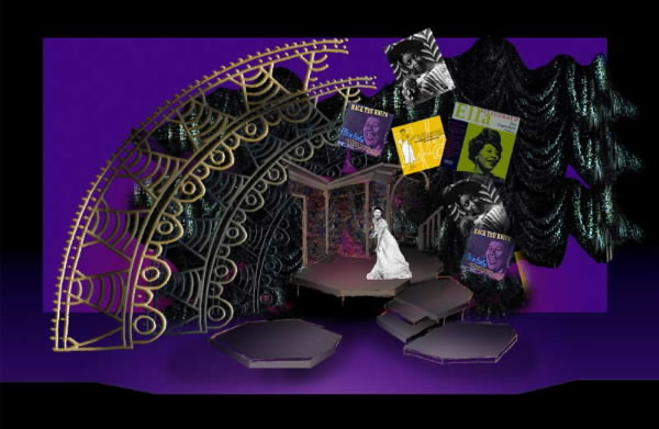
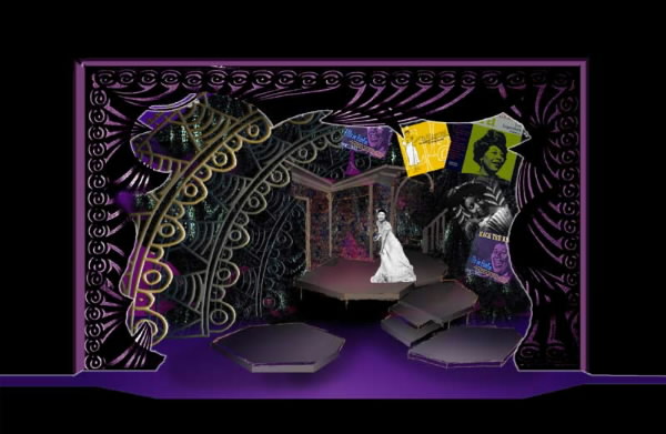
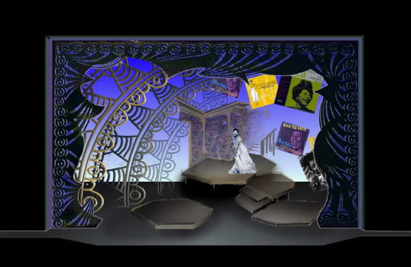
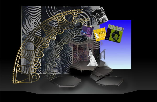
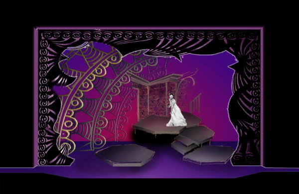
The elements were designed to be "light reactive" in that they can change radically depending on the lighting. These sketches to some extent also simulate how the look of the stage can change with lighting.


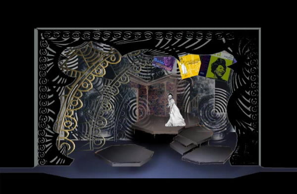
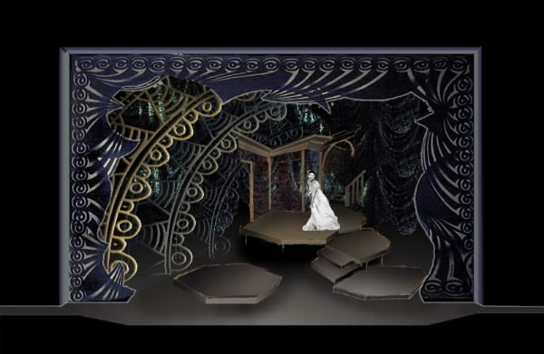
Conceptual Foundations: The set presents the required areas but within a dramaturgical context. The father's living room is an island within a jazz-aged performance venue. The house itself has elements of the old, the Victorian, with faded floral wallpaper, cornices, and the like. Surrounding it on the outside and stage right, are a series of portals. The jazz age has it's visual equivalent within the deco style and these portals are derived from that style. The three arched portal elements are not complete but in one scheme they segue into elements of album art and portraiture from the three singers profiled. This seems to form a spiral through time. The period venue portals beget the more modern element of recordings, which lead inside to the location where the recordings are played, at the father's house, with it's traditional ties to earlier eras.

Not shown yet in the illustrations is a tri-fold mirror unit on the intermediary platform, one step down from the father's living room platform. These mirror units are full-[human] sized. These would allow the reflection of Lynnie to transform into the image of each of the singers in turn. In the end, all 4 singers would in essence be performing on stage!

Stylistic note: My set designs are always very 3-D...sculptural. In 2-D form, they always appear to look "busier" than they do on a real stage. This is especially true in my light reactive settings. When light is removed the elements fade into the background. I am confident that a single performer will NOT be lost within the elements, but the elements would nicely frame her in. The effect of this set in fact is not unlike the one I used in the NYSTI's 1982 production of All-Time Good-Time Knickerbocker Follies (but without the financial and labor pain. Here we get the effect but without the bucks!)
The Possible Elements: Description of
What is shown in the sketches:
  • Show Portal. This is a painted element drawn from a detail in a c. 1925 painting. I can talk to Mark about whether we make this soft or hard-framed. The light portions of the design are all translucent so that lighting from the back can change the color characteristics of the unit to match the mood of the various songs and singers.
  • 3 Partial Portals. These too are light reactive. They would be made simply due to budget constraints, probably of cut-out plywood with ethafoam applied for added dimension. There would be gathered cheesecloth or similar material applied behind the openings to further catch and react to the changes of lighting.
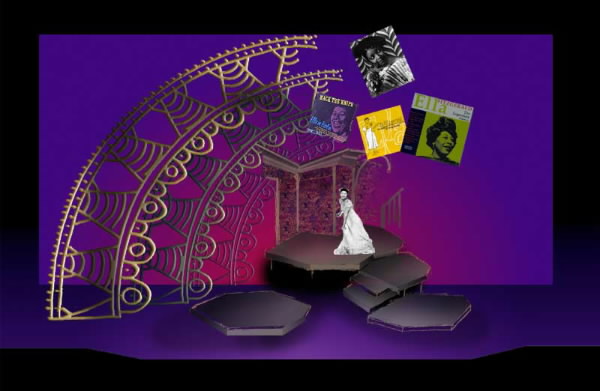
  • Album Covers, Posters, etc. - Bob, in our original conversation you did not appear to be too interested in such elements and indeed they can be cut. They do add an interesting balance to the elements of theatre architecture (the portals). We'd also need to at least explore if there are any real issues of copyright in their use. It would likely depend on the scale and location of our largest anticipated venue.
  • Glam� type curtain - This again provides for more opportunity to interact with light to create magical moments. While true glame is very expensive, I have had GREAT success using camo net painted silver. It drapes wonderfully! To see it's use in a show, go on the web to my design for The Misanthrope at http://www.rfdesigns.org/misan.htm
  • Cost-effective translucent drop - This element too is drawn from a 1925 painting. Although translucent, it can be painted in panels so we do not have the problem of expense as with full-stage one piece translucencies. Backlit with colors of light, this can change mood with the pieces. 
  • Cyc - Personally I prefer the camo net and/or translucent drop over this being a "cyc show", especially in the triangular Schacht stage where cycs are never too wide. But the cyc approach would cost the least.
  • Platforming - Here's the poop: UC is a platform for the father's room with possible entrance from stairs coming as though from an upper story. Moving down Left there is an intermediary platform serving as a landing on which the mirrors could be located with two additional steps then leading to center stage. Framing these platforms on two sides then are low platforms for the band halfs.
  • Walls of her father's room. These would be totally skeletal with corners, a hint of a door frame, and cornices. The walls themselves would be a print organza, very wispy so that the backings could be seen through the walls. The effect is ethereal. Of course photos etc can be on the walls.

Not shown [yet] in the sketches:

  • The Band and the fancy music stands
  • Trick 3-part mirror
  • Furniture in her father's room
  • Chandelier in her father's room - If we choose to go this route
  • Pictures etc. on the wall in the room.

Remember the music stands, bands, furnishings are not shown. If the concept/overall scheme is approved I may also try to better integrate the DS and band areas of the set. This view shows the portals (with cool grey light through the first portal translucent areas. The backing is the silver glame camo net cathing the light. Note the see-thru quality of the father's walls and the stairs by which Lynnie could enter into the space.

In the above illustration the plain cyc is used without the camo net. My feeling is that while very pretty, the camo net provides more of the feeling of an intimate blues club or theatre.
Here the album covers are used but the first portal is not. This does not look too bad against the cyc because it relies on its simplicity as a stylistic element. Without the album covers half of the stage might look naked but I do not want to make the half portals into full portals as that would look too static. I like the asymetry which matches the ethos of Jazz and the blues themselves.
This has a darker feel. It uses the camo net but in a skeletal way making use of the cyc behind. It also shows how the mood changes with the specific coloration of the lighting.
This is similar to the first example but with the album cover art added in. In real life the yellow one would not take the stage so. Also this version has more color to again show the resonance of the set with light.
This view looks interesting. With the album covers in the picture, placing the show against the cyc does work. It has an open feeling although dark lighting on the cyc would somber the mood up a bit too.
I really like this drop idea. It would likely be an alternative to the camo net. In this version, the drop does not cover the stage. It is a funky approach with the cyc peaking out from behind. The colors in the drop could change with the lighting that shows through.
Here The drop covers the entire width of the stage. This option does not require cyc or camo net but the album art becomes important to break up the simple plane.